Bar Graphs
Connecticut Data Collaborative
Line Graphs
This interactive article from the New York Times is a great place to build your understanding of the line as representing a relationship. Check it out!
Which of the following is an example of an oversimplification?
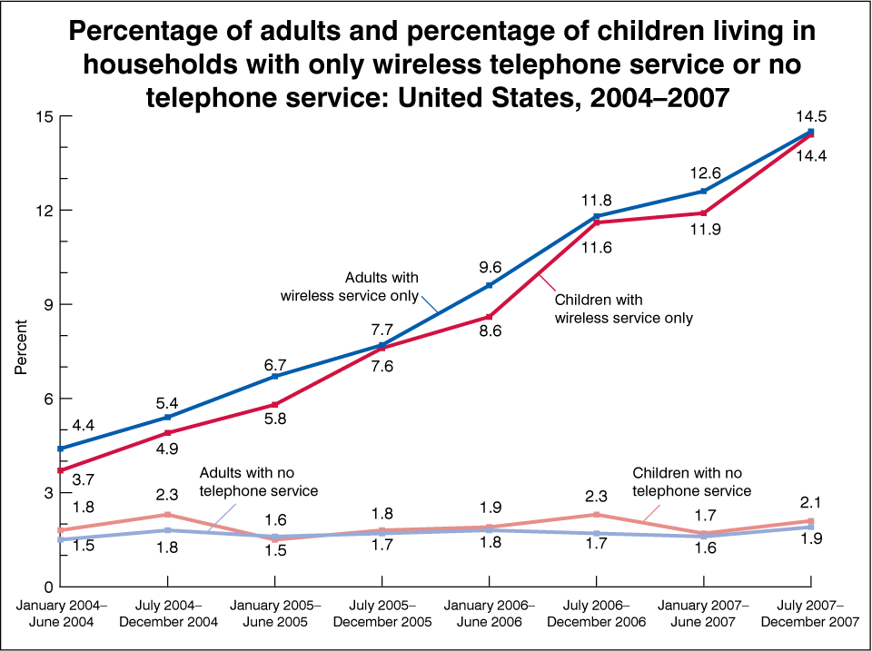
- Adults with wireless only service more than tripled.
- While wireless only service increased for those with telephones, the percentage of individuals with no telephone service has remained the same.
- With the growing popularity of cell phones, more children and adults are going to wireless only phone service.
- The fact that children and adults are never home anymore is the main reason they are getting rid of their home phone service.
- The trend of increasing wireless only phone service will likely continue into 2008 and beyond .
Check out this challenge question to use a line graph to answer a question. Click the button link below to get started.
Check out this site to build Line Graphs from sets of Data. Stick with it!
This is just like the Baby's Fever and the Marathon stories we practiced during class. I recommend giving this a try to make sure you're solid with this concept. When you can create the trend of the line and not just describe it, then you know you really understand.
Misleading Graphs
Watch a quick video about how math plays a role in the way merchandise is displayed in retail stores, including noticing how the same data can give a graph a different interpretation depending on how it is represented. Following the video, there are question you may answer for practice.
Advanced Graphing
Box Plot
On this page, you can use the interactive graph and watch the videos. For more in this module, click on the lettered tabs.
Visit this site for a virtual manipulative to help you understand Box Plots. See a Box Plot's relationship to the Histogram.
Histogram
The Advanced Data Grapher can be used to analyze data with box plots, bubble graphs, scatterplots, histograms, and stem-and-leaf plots. You can enter multiple rows and columns of data, select which set(s) to display in a graph, and choose the type of representation.
